Terrible American kits all started with the United States’ shocking outfit for the 1994 World Cup, though the early MLS kits made that effort look like artistic genius.
The MLS is slowly undergoing a rebrand, with kits becoming more normalised, the standard of play improving, and the club crests being watered-down.
SEE MORE
Injured Player – Was carried off by the goalie in the MLS this weekend
Tigres Fans – the best fans in the Liga MX were in fine voice this weekend.
MLS TV – MLS stars racing cars – a new TV series in the US
It wasn’t always like that though. Here are our three worst kits in MLS history.
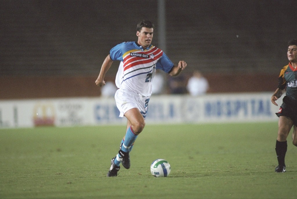
3: Kansas City Wiz – Yellow, red, white and blue diagonal stripes. Classy.
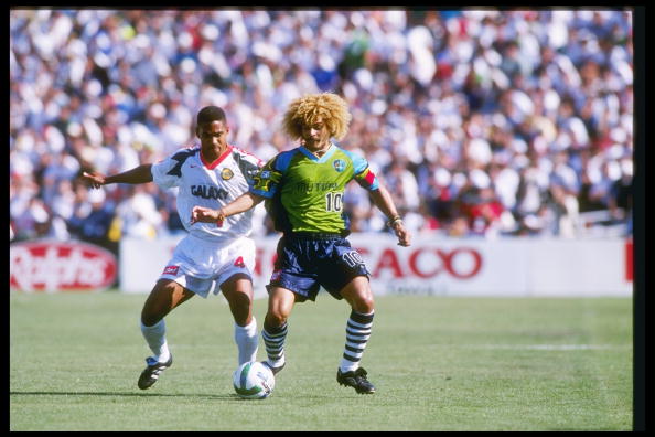
2: Tampa Bay Mutiny – The players should have mutinied after seeing this effort
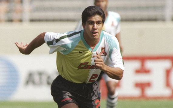
3: San Jose Clash – Clash is definitely the right word. No further comment.


COMMENTS