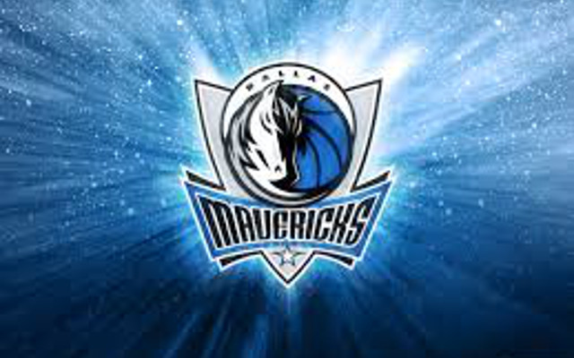
4. Dallas Mavericks
The Mavericks changed their logo in 2011, and it has been met with mixed reviews as it features a horse that does not look very aggressive. Instead, the horse looks like it’s asleep. However, the logo is relatively fancy as it’s colorful and bigger than their previous logo with a cowboy hat.

COMMENTS